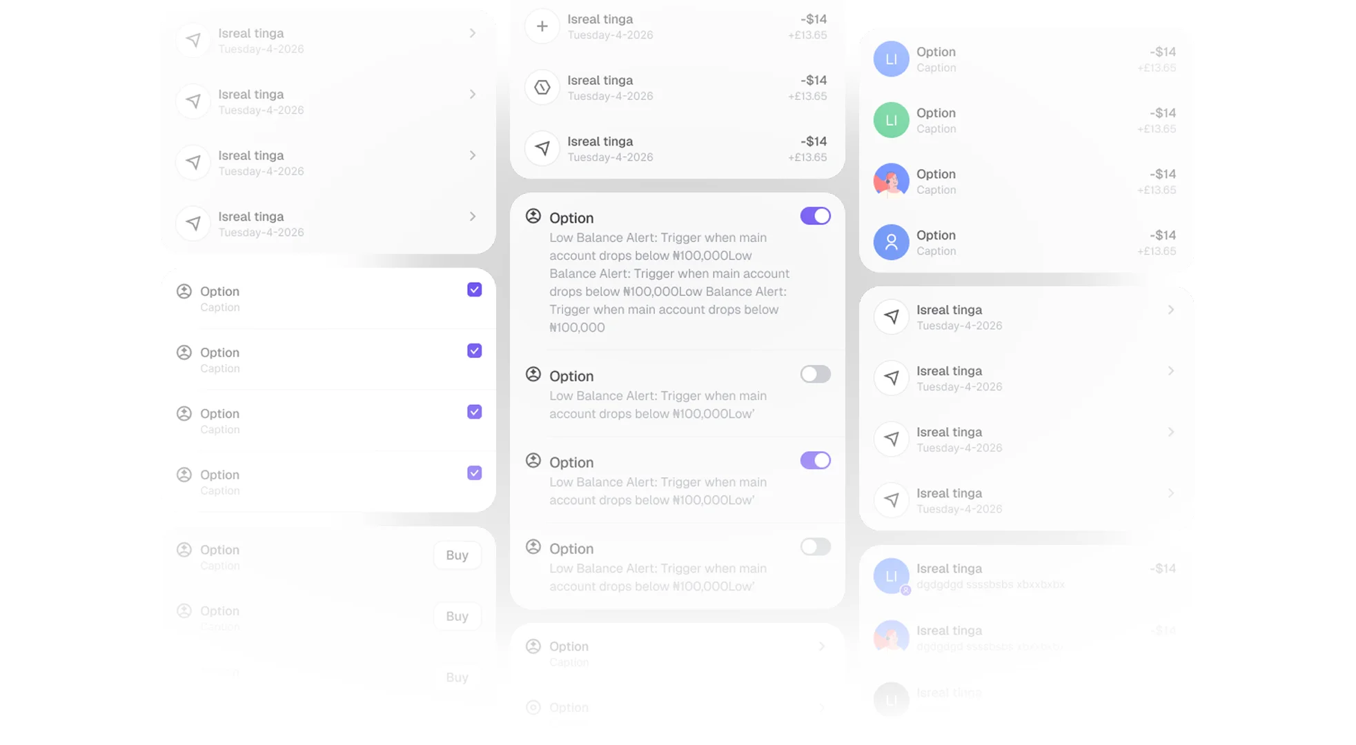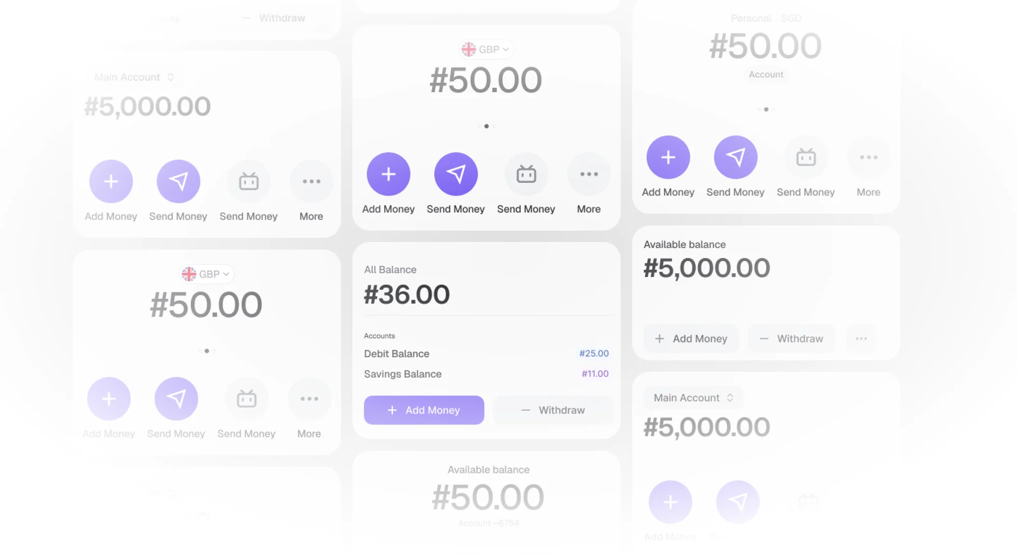
Built from experience designing fintech products, where recurring patterns and foundational UI needs often appeared across different experiences. The system brings these patterns together into a scalable foundation for designing consistent fintech products.
Built on the principles of atomic design, the system starts with a strong foundation of color, typography, spacing, backgrounds, and other core design tokens.
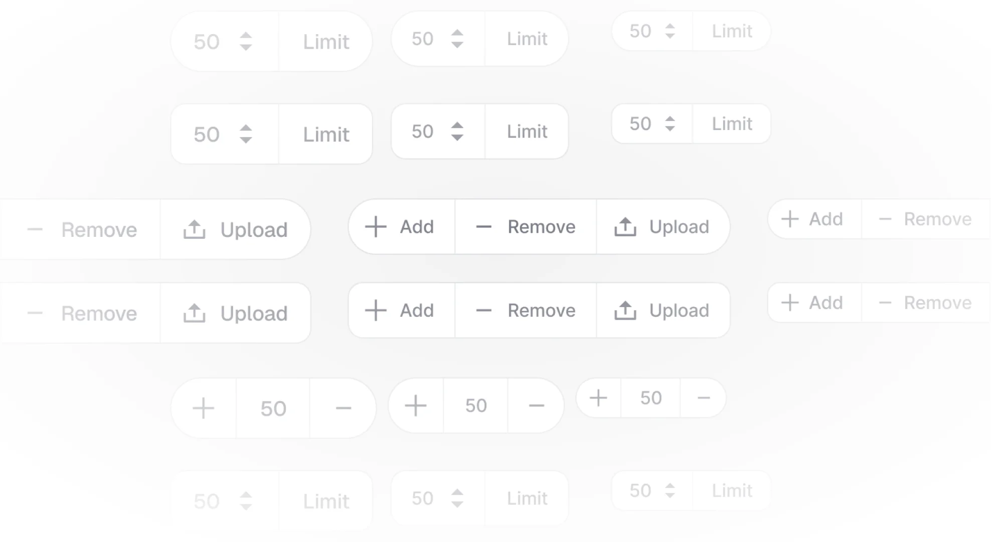
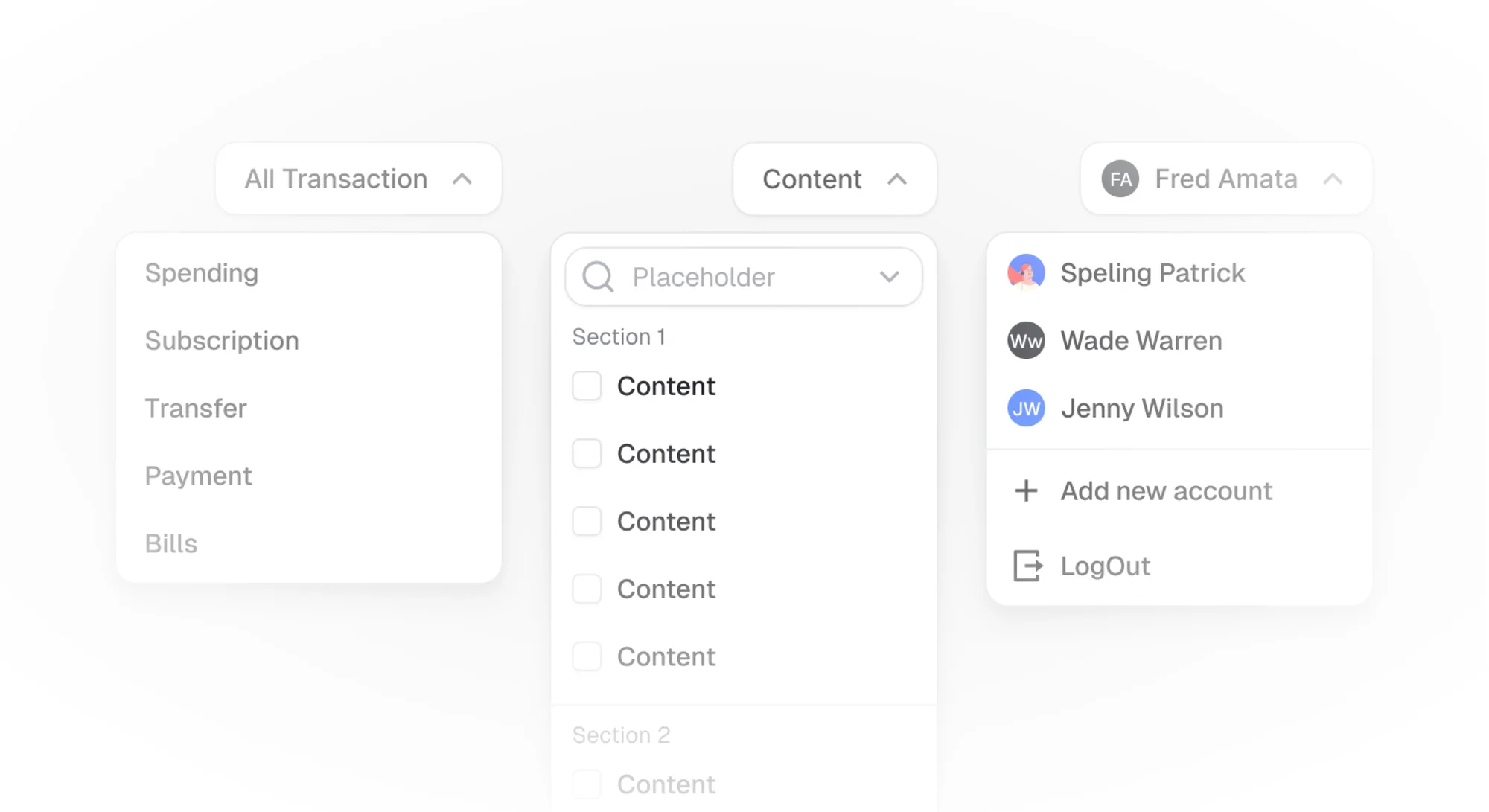
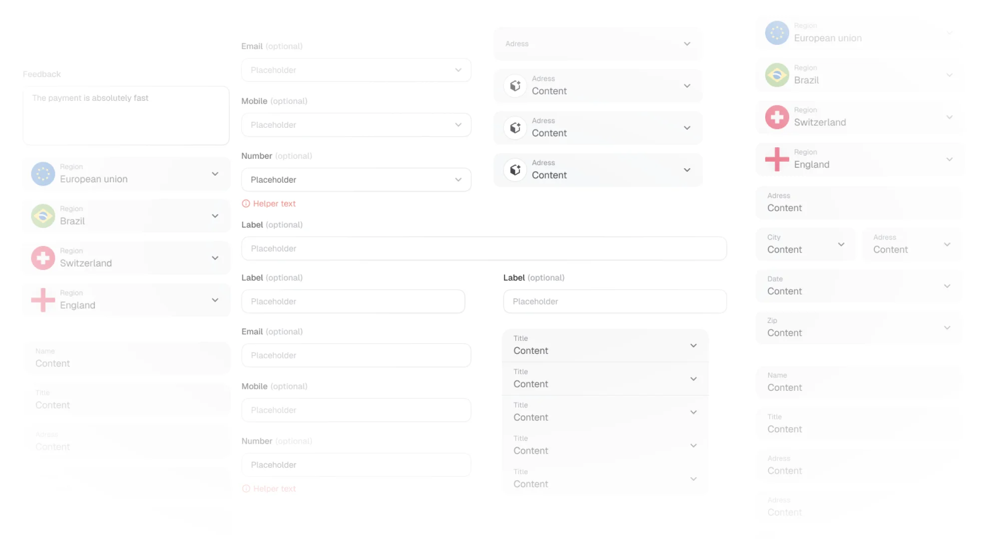
These foundations come together to form a reusable component library, making it easier to design, iterate, and scale fintech experiences without rebuilding common patterns from scratch.
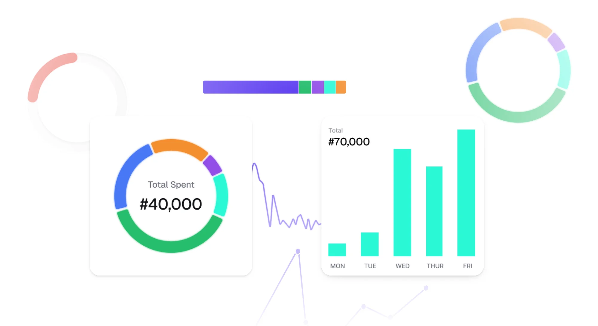
A design system is never truly finished.
As fintech products and patterns continue to evolve, the system is continuously refined, adding new patterns, improving existing components, and adapting the foundation to support faster and more consistent product design.